Feb 14th, 2009
Worst Google Logo Ever
I have always enjoyed the Google holiday/event logos. Not only are they often very creative and artistic, but they highlight a wide variety of notable dates beyond usual holidays: birthday/anniversary days of significant people, and landmark events of all types ranging from the well known to very geeky. Some of my favorites appeared just last year:
Earth Day:

Large Hadron Collider activation (and the potential end of Earth):
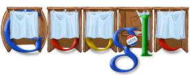
 Election Day:

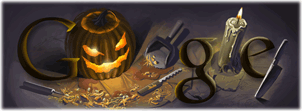
Their artistic ability (or standards, for guest artists) has greatly improved over the years. Here is their 2008 Halloween logo:

Compare that to their less impressive, cut-and-paste clip art effort from 1999:

They’ve definitely raised the bar, and I’ve come to expect high quality, clever logos from Google. Which brings us to today, Valentine’s Day 2009:

Boy, they really spared no expense on this one! Font-color = Red. Wow. And the kisses and hugs… well my first reaction when I saw the logo was that Google.com had been hacked. The X and O look like something found at a crime scene in “CSI”. Not well done, especially for Valentine’s day.
Oh well, maybe next year. I still like the holiday logo concept and Google’s minimalist style (as opposed to the fancy animations over at yahoo.com), but they showed their slack side today.
2 Responses to “Worst Google Logo Ever”
I was on google at least 5 times today and didn’t even notice the logo. It DOES look like something out of CSI though… the XO killer!
I agree, it didn’t look good. Maybe they wanted to remember the 90th anniversary of the Valentine’s Day Massacre.
Or, they were just late on their Super Bowl logo.